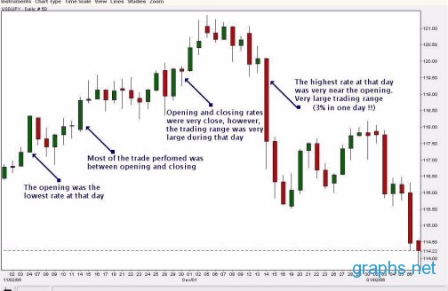
A currency graph is a chart of the “movement” of a currency pair over a given period of time, ranging from monthly, to daily, to by the minute updates. A currency pair is the correlation between two different currencies. The first in the pair is the base currency while the second is the quote currency. The currency pair depicts how many units of the quote currency is needed to buy one unit of the base currency. For example, GBP/USD 1.350 means that 1 GBP (British pound) is equivalent to 1.350 USD (U.S. dollars).
These charts are used by technical analysts to study past price movements and predict possible future movements of currency pairs. Fundamental analysts, on the other hand, use these charts to find correlation between trends shown in the charts and events that occur parallel to that, such as politics, economy, weather, and so on. Also, depending on the specific need of a trader, the time range that a chart focuses on can vary. A short-range investor might use a chart that plots currency movement for a single day while mid- to long-term investors might depend on weekly or monthly charts.
The structure of a currency chart is quite simple. The values of the currency pair are mapped on the vertical axis while units of time are placed on the horizontal axis. Price movement is then mapped using lines or candlesticks, the most common type of charts used in market-related graphs.
Due, however, to the dynamic nature of currency charts, it will be quite tedious to graph this movement by hand. In almost all cases, specialized software is used in drawing the graphs. This allows users to adjust the time focus of the chart or monitor different currency pairs. There are also a lot of free currency charts available online that offer up-to-date changes. With the growth of the Internet, technical indicators that were once available only to brokers and professional traders are now available to any trader with a computer.