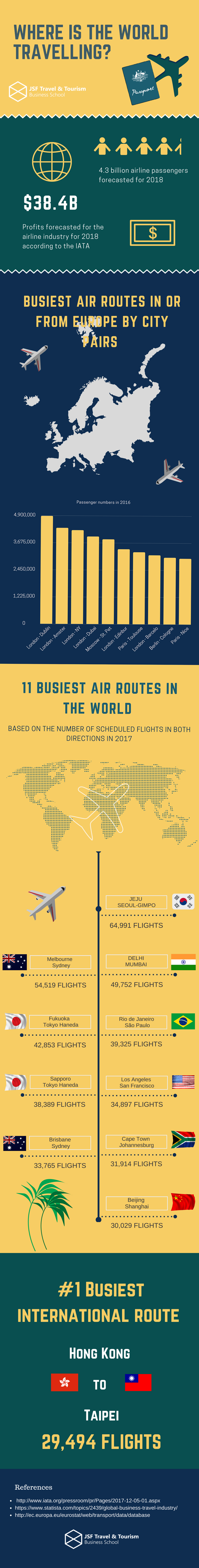
Air travel is one of our favorite ways to get around, with millions of flights worldwide every year. In fact, 4.3 billion passengers are taking to the sky this year. That's a lot of airplane food and juice packets!
We often forget that air travel is quite new in our history because it's now so widespread and has been made so affordable, in part by budget airlines and technology. Between countries, cities, and continents, air travel has enabled us to bring the world closer together and has changed the way the world does business, makes friends, and connects at the deepest levels.
But where are people traveling to the most? Which air routes have the most traffic in our skies. What does aviation look like in today's fast-paced world? JSF Travel & Tourism Business School took a look at the most popular flights in Europe and the world for this travel-obsessed infographic.