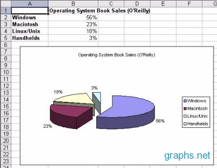
Market share refers to the percentage of the total available market segment that is serviced by a company or group. In other words, market share represents a group’s strength in relation with other groups in the same market segment. This can be expressed in terms of a company’s revenues, sales, or users divided by the total number of revenues, sales, or users in that market segment. Since market share involves a lot of figures and data probably spread over a wide geographical area, some amount of professional market research is usually commissioned in order to produce the needed information.
Market graphs present these figures in a visually appealing and easy to digest manner. A list or table would usually require more scrutiny and analysis of the figures in order to give an overall view of the market segment, while a simple graph can more easily give a bird’s eye-view. For this reason, pie charts are commonly used to express market share, as this type of chart, by nature, shows data in relation to the whole, which is exactly what a market share graph should show.
Creating market graphs is easy using any popular spreadsheet application, like Microsoft Excel, Google Spreadsheet, or OpenOffice.org Calc. Only two columns are necessary, the first column composed of labels indicating the different market segments, while the second column contains the actual figures, either in raw numbers or already in percentage form. Then, with a Chart wizard, a pie chart can be generated from the selected columns, with the columns set as the series of the chart. Make sure to make the percentage legends visible on the pie chart itself. The generated chart can then be used either embedded into the current sheet, together with the figures, or on another blank sheet.