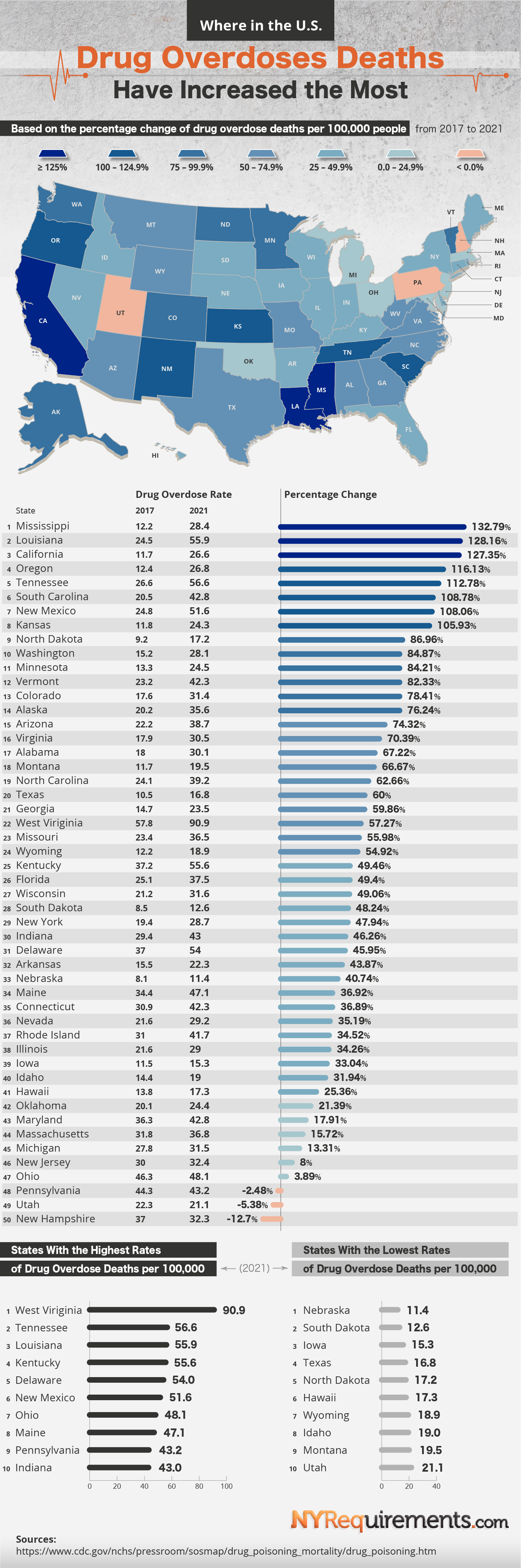
Since the 90s, over a million Americans have died of an overdose death. Out of these deaths 75% were caused by opioids. Drugs like fentanyl have only added to the danger and the increase in deaths. To get a visual representation of how serious the problem is, the team at NYRequirements.com created an infographic in the form of a map. The map shows the increase in overdose per 100,000 people. They used data from the CDC to track deaths from 2017 to 2021.
The results show what shocking leaps have happened in overall deaths. A majority of the U.S. experienced at least a 50% increase in overdose deaths. The map doesn’t really show a trend by region or how populated the states are. Only three states had a 0% increase. This was Utah, New Hampshire, and Pennsylvania. These three states actually saw a decrease in deaths from 2017 to 2021.