Internet is full of exciting websites that attract the viewers. With the availability of wide array of choices and various alternatives, most individuals simply skip a site, if it takes even few minutes of their time.
People are always in a hurry to get their things done and tend to get easily annoyed. This changing lifestyle requires the industry to change accordingly, in order to meet the demands of netizens. This infographic specifies some useful tips to optimize your online registration form, so that users can access it conveniently.
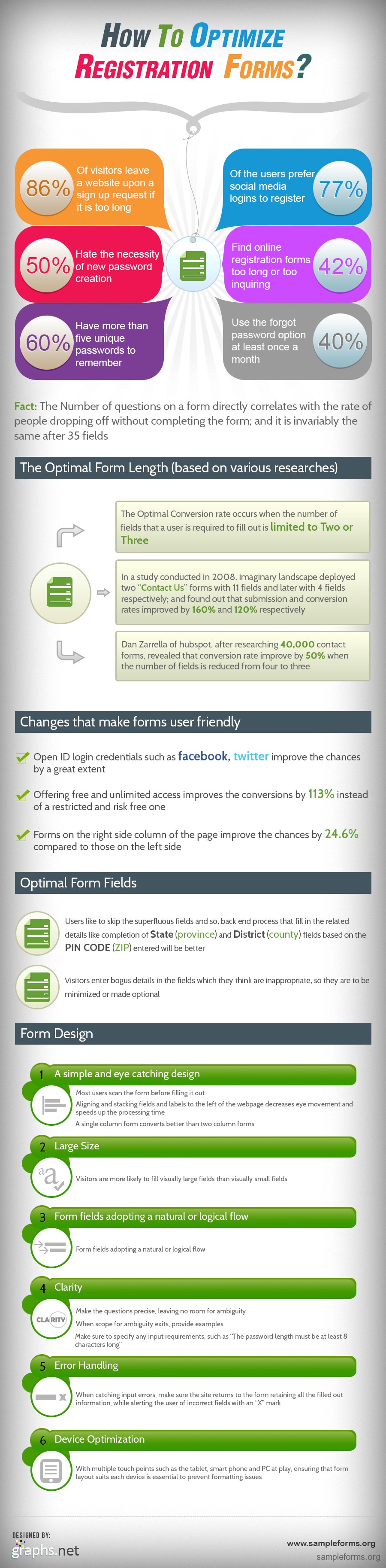
If the signup process takes too long, 86% visitors quit it.
42% individuals find registration forms too long to fill or too enquiring.
If the visitors feel that some fields are inappropriate, they fill it with bogus details and so it is better to minimize them or make such fields optional.
The form should have simple format and single column forms work better than two.
Font size of fields should be visibly large.
The questions should be short and unambiguous. In case of ambiguity, you should provide examples.