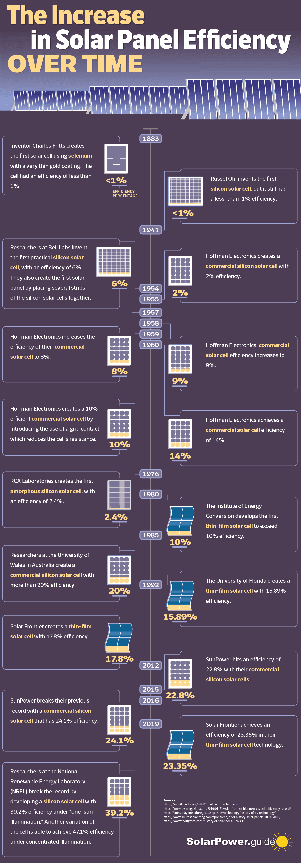
The science behind solar panels is quite interesting. You might not know however, just how efficient they actually are. This infographic from the team at Solar Power Guide shows the increase in solar panel efficiency over time. According to the chart the first solar cell was invented in the late 1800’s. Knowing that we didn't even have sliced bread until the 1900's, it was such an early discovery for this type of technology. The first solar cells were less than 1% effective, but they still worked and more importantly it showed that this type of energy could be harnessed and improved upon. Another interesting fact from the graphic shows that many different companies have tried to be the most effective in the market with varying degrees of success. Today the record-breaking number of efficiency of a solar cell is 39.2% from the researchers at INREL with a silicon solar cell panel, I'm still shocked that all these percentages are less than 50%.