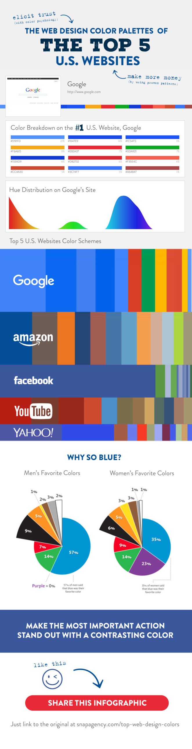
The colour palettes for the top 5 U.S. websites are drenched with blue, more blue and another shade of blue. It elicits trust, conveys firmness, is everywhere, and is both men and women’s favourite colours. The web plan to stay on top of the latest web design colour styles, and create valuable resources for web designers and marketing professionals, but most importantly to have a long-standing view of colour and a deeper understanding of colour psychology. Google is the top U.S site that uses four key bright modern blue, red, green, and yellow and with lots of white space. While an amazing number of top websites in the world choose for the use of blue, green. It is a close adherent and is the second top favoured colour for men and women as well.
According to emerging colour trends of 2016, don’t get wrapped up in the fleeting flash in the pan colour schemes but instead plan website for the future, and how the colours will stand the test of time. The finest web design colour palette for a company is going to be a easy one, with a lot of white space and a contrast, vibrant colours to prompt a visitor in taking the most obvious next step. For constructing a colour scheme to last, but still paying attention to the trends is our freshly launched design for a fashion brand where in a doze to pale pink, a powerhouse of a colour for 2016, we included it, but made it close to skin tone. In this way, the client can able to update photography and despite next year’s colour line it will always relate to the pale pink used in the site.